|
Adobe InDesign Project One Syllabus - Page Layout Marte Thompson, Instructor email: marte48@gmail.com Adobe InDesign is a digital desktop publishing layout software, similar to QuarkExpress. It is used for basic "prepress" formatting or page layout, of everything from 4-color brochures, to magazine and newspaper advertisements, to entire books and documents. The initial project for the course will be to recreate an advertisement page from the Via magazine, the AAA membership travel magazine. Not only will we recreate them, we will talk about how they can be improved. From this project you will learn: |
 |
|
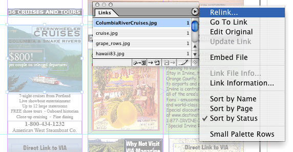
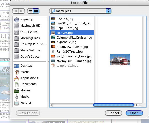
1.) Basic prepress graphics layout and formatting concepts, such as page size, margins, columns, gutters, headers, footers, etc. We will discuss how to "pre-set" these in the document page setup menus, and create a "template" for the pages in the magazine. Within this template format, we will explore creative arrangements of the elements of the design. 2.) Typography - we will discuss type font classifications and styles, and how to use these appropriately. We will use the content provided in the existing ads, but we will talk about how these can be improved as to type or font style, placement, and effectiveness. In the process, we will learn how to use the type, font, and character tools. We will also discuss right, left, full and forced justification, as well as text wrapping and wrap-arounds. 3.) Photos - we will search for and use appropriate photography from online and stock photography sources. We will discuss pixel resolution for print as opposed to web images, as well as color modes (CMYK versus RGB, etc.) We will discuss clipping paths for irregularly shaped photos. We will learn to place and import photos, and how to fit them to the image box. For "comping" purposes, we will use low-res (72 dpi) photos from the web, but they will eventually need to be high resolution (300+ dpi.) 4.) Line art - may be scanned and traced in scalable vector graphics, such as Adobe Illustrator or Macromedia Freehand. They can be redrawn from existing or new and original ideas. We will be observant of logos and company signatures, and other such attributes of advertisements, also known as "brand" marketing. Line art, when scanned or "rasterized" (converted to pixels) should be high resolution - at least 300+ dpi. 5.) Linkage and File Management - As with Quark, the accessory files (such as the photos, logos, any scanned pieces, etc.) will be "linked" to the InDesign file, and thus will need to be in the same folder as the InDesign file. We will see how these linkage directory "paths" can be fixed or updated as we go along. Seen here are the menus used to update or "relink" the photos.
| |

